Anyone who has ever worked a day in web design knows how fast paced and dynamic this industry can be—and it’s not showing any signs of slowing down. If you are designing or revamping a website right now, don’t design for the current trends, which could be outdated by the time you’re ready to launch. Instead, look ahead to the future and try to incorporate these trends for 2017 and beyond into your website:
Demographic Based Adaption
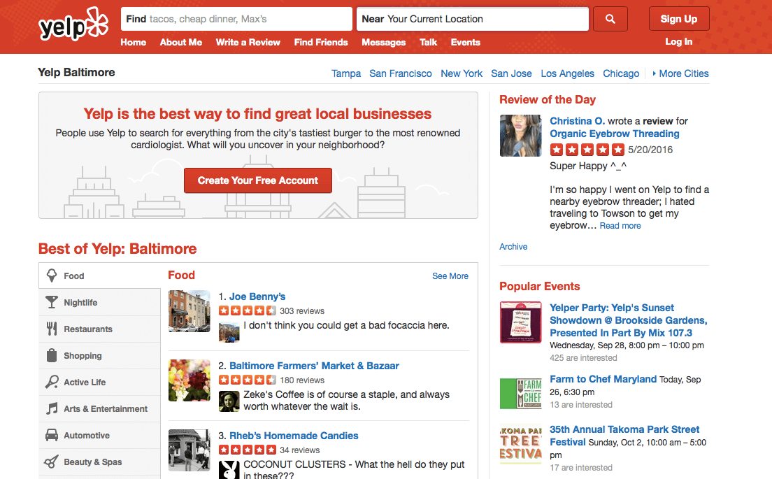
Personalization is key to acquiring and retaining customers, and one way websites can customize their offering is by adapting based on the demographics of the visitor. For example, a restaurant with multiple locations throughout the state of Illinois could use demographic based adaption to change the menu, contact information and customer reviews that appear on the website based on the visitor’s location. A website visitor from Chicago will see information on the Chicago location, while a visitor in Springfield will only see content from the Springfield location. This ensures each visitor sees the information that is most relevant to him, so there is a higher chance he will find what he is looking for and complete a transaction. But of course, location is just one demographic that should be tracked and used to adjust your website’s content.

Photo Credit: Yelp
Why is this so important? Research has shown that 40% of customers buy more from retailers who personalize the shopping experience. Even if you are not an e-commerce business, you are still trying to sell something, so create a unique experience for each potential customer who visits your site.
Storytelling and Animations
Storytelling is an important part of who we are as humans, and it has finally began to make an impact on the world of web design. These days, websites have to have more than just text and simple graphics. Now, websites are expected to grab the visitor by the hand and guide them through a story using images, videos and most importantly, animation.

Photo Credit: Hunger Crunch
Although animation has primarily been used to change the appearance of a website, it can actually improve the functionality of it, too. A well designed animated website will make it easy for visitors to figure out where to click and how to find the information they are looking for. It’s all about finding a balance between animation and information, so you can create a visually appealing, yet easy-to-navigate website.
Using storytelling and animation together on your website can help you capture your audience’s attention and engage them with your brand.
Unique Grid Designs
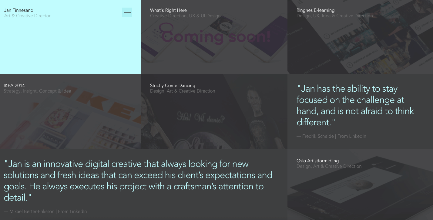
In the past, websites have often defaulted to the responsive grid design when creating a website layout. This design layout splits the website into 12 columns with a total width of 100%, and will resize as needed depending on how the visitor is accessing the site. Companies have often chosen this layout because of its ability to adjust to mobile, tablet, laptop or desktop browsers with ease. But, as the industry evolves, there’s no need to stick to this standard layout anymore because responsive design has become much more flexible. Brands no longer need to think in terms of 12 columns when designing a website that can be accessed across all platforms. This evolution will help designers create unique and interesting websites that aren’t constrained by the old rules.

Photo Credit: Jan Finnesand
Continuation of Parallax
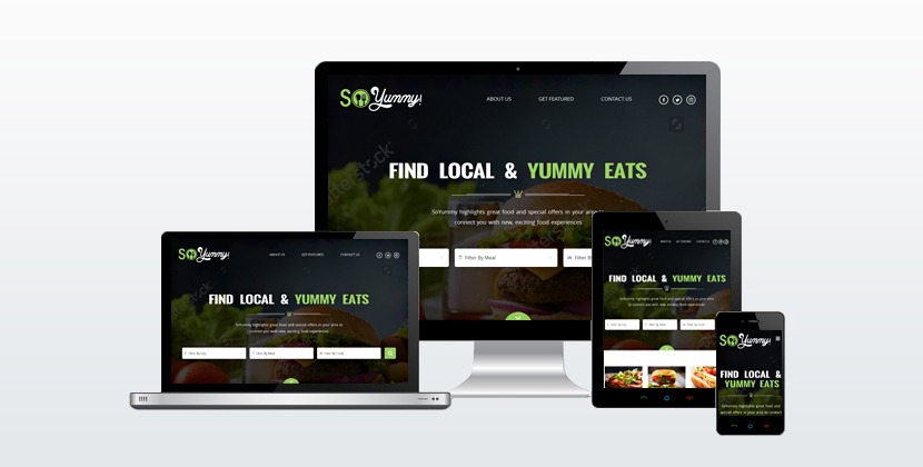
Parallax is a design technique that allows websites to have somewhat of a 3D appearance. This special effect is created by moving the background and foreground images at different speeds while the user scrolls down on the screen. Although this technique has been used for the last decade, it is still trending all these years later. In fact, some web developers may argue that it is becoming more popular as designers begin to find unique and creative ways to use it on their websites.

Photo Credit: Fire Watch
When using this technique on your website, it’s imperative that you set the foreground and background images at the perfect speed. Use a trial and error approach and don’t be shy about asking other people for their opinions. If the speed is not set correctly, visitors may get a little motion sick and disoriented as they try to read your website’s text while scrolling down.
Mobile Apps
It’s no surprise mobile apps made the list of web design trends—after all, thousands of businesses have launched mobile apps to help their customers reach them on a whole new platform. But, will this continue?
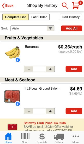
There are two sides to the mobile app coin. On one side, there are the businesses that are wary of spending thousands of dollars on building a mobile app. Many of these businesses have decided to rely on hyper responsive design for specific portions of their website instead of creating a mobile app. This gives these businesses the same mobile-friendly functionality as an app without having to make a large investment in its development.

Photo Credit: Safeway
On the other side of the coin, businesses are doing the exact opposite. These businesses are focused on building out their mobile apps to replace entire portions of their websites. Why? Many industry experts predict that apps will one day kick websites to the curb, so these businesses feel they are getting a head start on the inevitable.
Which approach should you take to mobile apps? It depends on your business. The majority of businesses who have decided to use hyper responsive design to replace the need for an app are in the B2B space. But ultimately, it depends on how much you have to invest in mobile—if you don’t want to go all out, it’s much cheaper to go this route instead of developing a branded app.
Remember, you don’t have to incorporate every single one of these trends into your website to make it work. Landing on the perfect design for your website is about taking a closer look at each of these trends and deciding what is right for your business.

 Menu
Menu 


